Italian Yield Curve
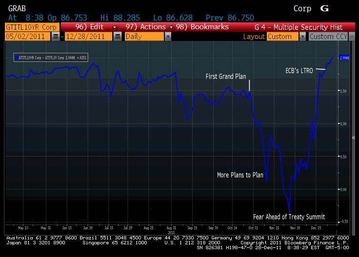
With all eyes focused on Italy and the “success” of Italian bond auctions, I thought this chart might be useful.
Attention has been on the 10 year (was 7% again until earlier this morning) and how much cheaper the 2 year came than just a few months ago.
Clearly Italy has done some things to calm the markets. When 2’s and 10’s were inverted back in late November, the market was extremely nervous that Italy was headed towards default. Inversion is a clear warning sign. The move to a more “normal” or “steep” curve has been impressive, but is it becoming too impressive? It is now steeper than at any point in the last 8 months. It is steeper than before Italy was really on anyone’s radar screens as a potential default candidate.
This is evidence that the LTRO is working to some extent, though probably by reducing asset sales rather than increasing asset purchases. It may also be that the market has digested the MF Global sales of short dated Italian paper (and those who bought it from them at a nice discount the weekend of the bankruptcy). It may be that other institutions are done cleaning up positions that looked similar to those of MF Global (remember the repercussions of the trade killed MF, but the trade itself worked).
In any case, I think the unnatural steepness means it is hard to look at the auctions and accept them at face value. It is yet another data point that really isn’t a data point. Throughout this entire crisis (going back to 2007), the governments and central banks have made efforts to “fix” certain things. If LIBOR gets too high, then they take action, that at least temporarily improves LIBOR. Those who look at the “improved” data and think the problem has been fixed have been proven wrong, as the market exposes other holes and eventually even the government and central bank money can’t keep the prices artificial for too long without forever increasing the amount of public money at risk.
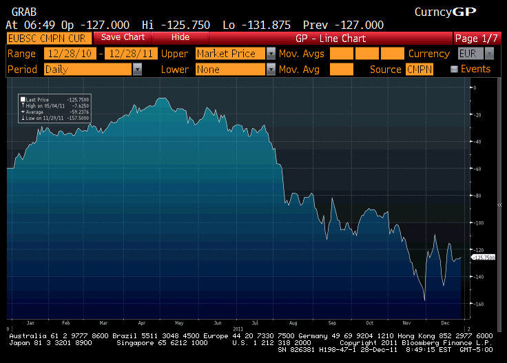
There may be no better example of that phenomena than the Euro Basis Swaps.
To some degree, this rate measures the difficulty that European companies (banks) have when trying to get dollars. The First “globally coordinated” action in September brought the rate back from-110 to -80. That faded until it hit an almost scary -160. The Second “globally coordinated” swap line action got us all the way back to -110 (about the same level that had sparked the first action). We retraced some of those gains, saw fresh gains on the back of LTRO, but again have stabilized at rates that are worse than what the policy makers have targeted. Where would these rates be without intervention? Should we be happy about the improvement, or should we be concerned that in spite of all the intervention, this is the best they could do?
In a somewhat free market (somewhat free markets seems the best we can hope for) you could look at this data and say that the situation has improved. Given all the intervention, I think the basis swap is telling us that the market continues to deteriorate for Europeans and the overly steep Italian yield curve is a sign that manipulation is driving prices and not actual market belief in a resolution.


